Shelfish is a conceptual typographic project conceived as a tribute to the oceans and a call for environmental awareness.
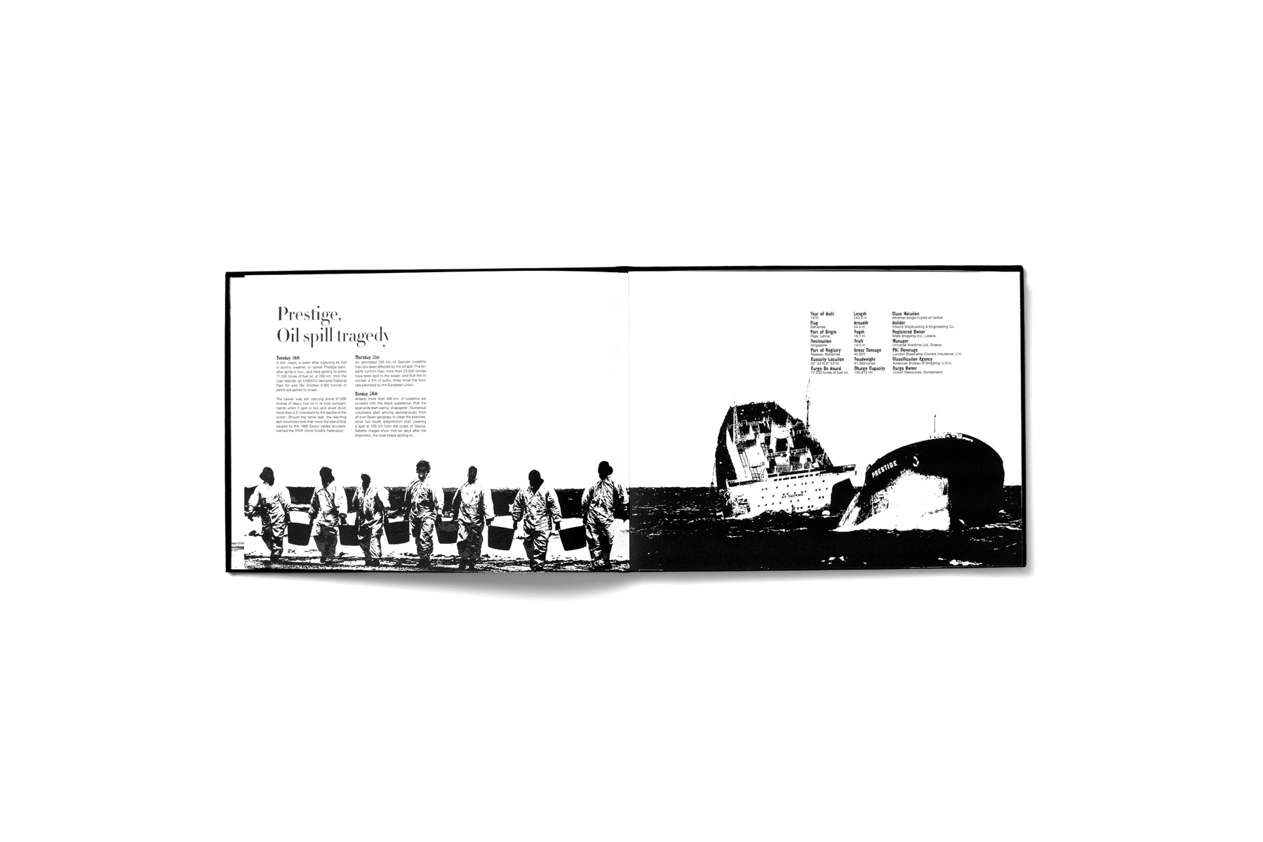
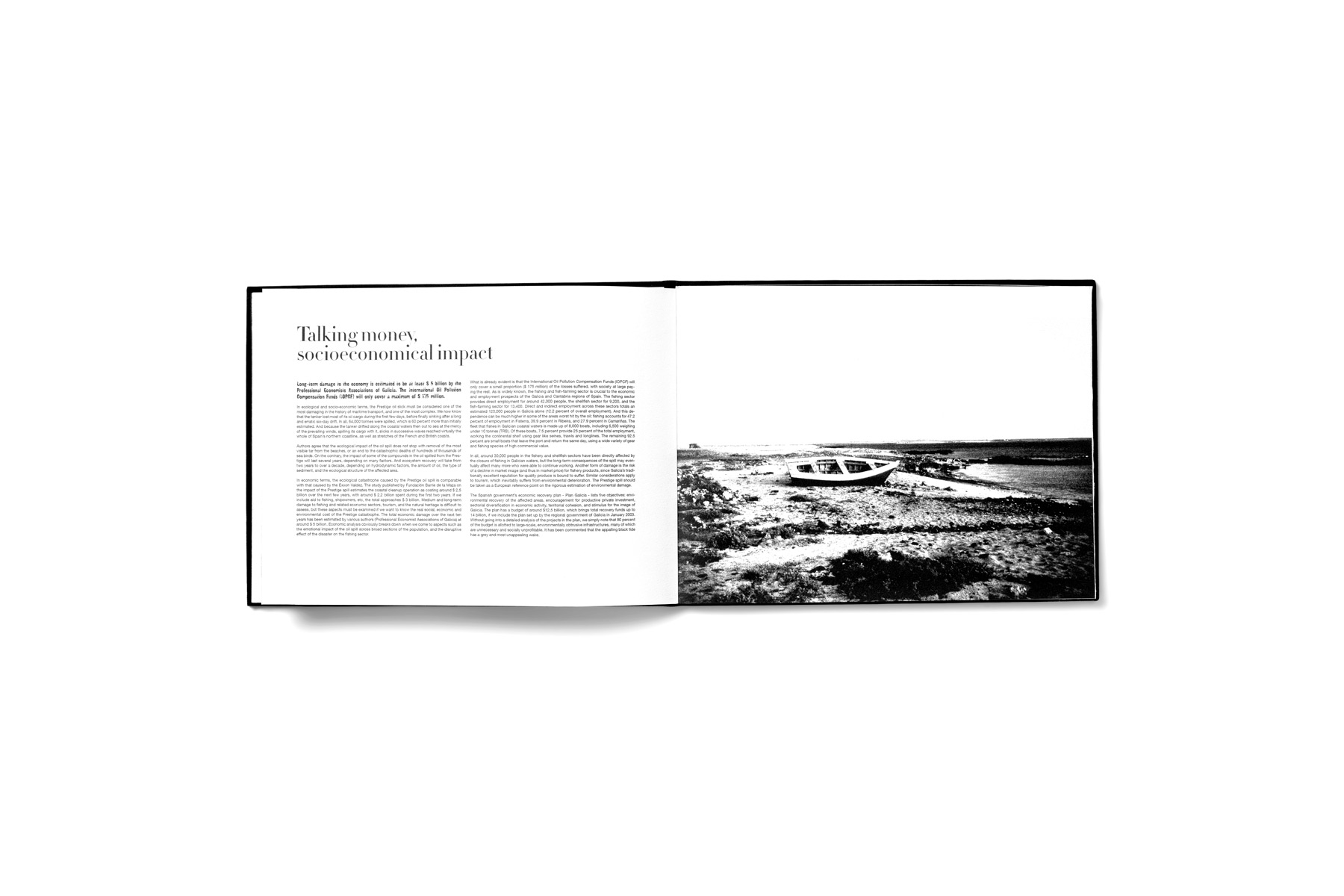
On November 19, 2002, the oil tanker Prestige sank off the coast of Galicia, Spain, while carrying more than 70,000 tons of fuel oil, triggering one of the most devastating environmental disasters in modern European history. The spill had catastrophic ecological, economic and human consequences, particularly in a region whose livelihood, culture and identity are deeply tied to the sea. What had once been a coastline defined by beauty and abundance was suddenly covered in black.
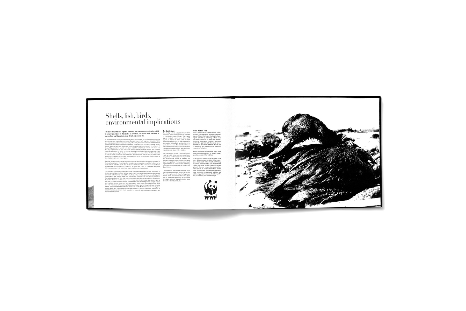
Thousands of volunteers arrived from across Spain and Europe with a shared objective: to clean what seemed impossible to clean. Despite these efforts, the damage continued to unfold. The tanker, resting deep beneath the ocean, kept leaking. Oil slicks reached not only Spain’s northern coast, but also Portugal, France and beyond, threatening one of the richest marine ecosystems in the world. As oceanographer Dr. Simon Boxall described it, the Prestige became “a time bomb at the bottom of the sea, waiting to go off.”
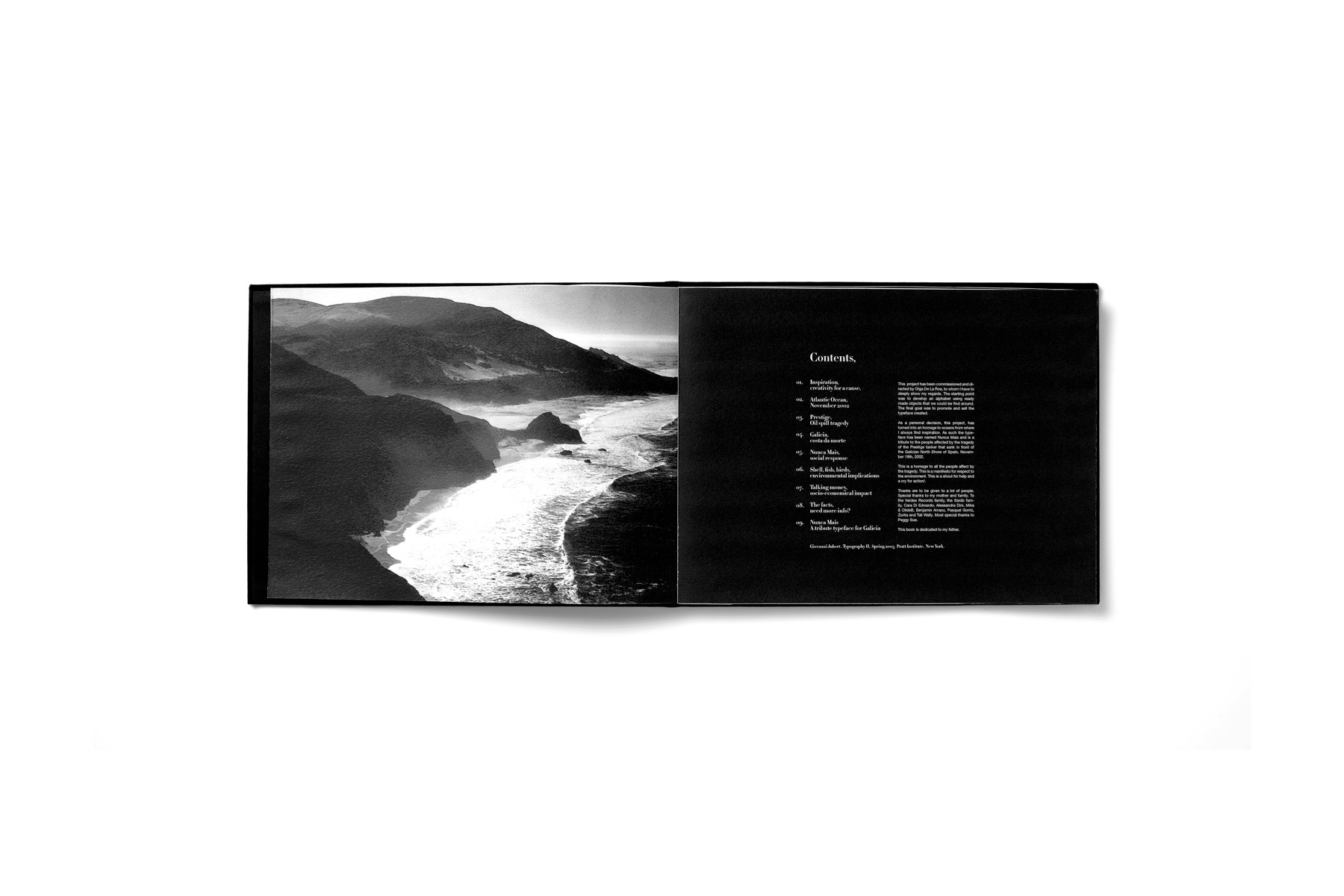
Shelfish was developed in 2005 as part of the Graduate Communications Design Program at Pratt Institute, under the guidance of Olga De La Roza, Graham Hanson and Don Ariev. The original assignment was to design an alphabet using objects, followed by a final piece that would promote and present the resulting typeface.
As a personal decision, the project evolved beyond a formal exercise into an homage to the oceans and to nature. The alphabet was developed using shells and marine elements, transforming typography into both a visual language and a symbolic gesture. What emerged was not only a typeface, but a manifesto—a reminder of the fragility of marine ecosystems, a tribute to the people affected by the disaster, and a call for responsibility and action.
Shelfish stands as an early exploration of design as advocacy, where typography, concept and narrative converge to carry meaning beyond aesthetics. It is a reminder that design can be a voice, a memory and a warning.
We shall never forget.